UWAJIMA - ORANGE JUICE LABEL

For the three designs, three different shades of blue were selected for the backgrounds to further highlight the unique color of each variety. While enhancing the individuality of each fruit, the shared blue tones and ocean-inspired motif create a sense of unity and freshness throughout the series.
The design of each package also reflects the size and shape of the individual varieties. Smaller oranges are represented through multiple motifs arranged rhythmically across the composition, while larger fruits are expressed through elongated forms and vertical visual elements, emphasizing their distinctive characteristics.
A friendly and playful typeface was chosen to complement the overall concept, while maintaining high readability to ensure that product names and information are communicated clearly and effectively.
This design aims to express the charm of the growing region, the richness of its natural environment, the individuality of each variety, and the approachable character of mikan oranges through a simple yet memorable visual identity.
また、3つの品種それぞれの果実の大きさや形状に着目し、
デザインにも違いを持たせました。
小ぶりなみかんは複数のモチーフをリズミカルに配置し、
大きな果実は縦方向のラインや細長いフォルムを意識することで、
それぞれの特徴を視覚的に表現しています。書体には、
親しみやすく楽しい印象を与えるフォントを採用しながらも、
高い視認性を確保し、
商品名や情報が伝わりやすいデザインを目指しました。
産地の魅力や自然の豊かさ、
品種ごとの個性、そしてみかんの持つ親しみやすさを、
シンプルかつ印象的に表現したデザインです。
This design is based on the natural shape of mikan oranges, with the form simplified into geometric elements to create a visual style that is both playful and approachable.
The colors of the oranges are derived from the actual fruit, allowing the product’s characteristics to be communicated intuitively. Blue is used to represent the sea, while green symbolizes the mountains stretching along the coastline, reflecting the beautiful landscapes and rich natural environment of the growing region.
In addition, a radiating motif is used to represent sunlight, expressing the cultivation environment where the fruit grows under abundant sunshine.
本デザインは、みかん本来の形状を
モチーフとしながら、
要素を幾何学的に簡略化することで、
ポップで親しみやすいビジュアルに仕上げました。
みかんの色彩は実際の果実の色をベースにし、
商品の魅力を直感的に伝えています。
背景には海をイメージしたブルーを用い、
海沿いに広がる山々をグリーンで表現することで、
美しい景観と豊かな自然に恵まれた産地を
イメージしました。
また、放射状のモチーフを太陽の光に見立て、
十分な日照を受けながら育つ栽培環境を
表現しています。
3種類のデザインでは、
それぞれの果実の色がより際立つよう、
背景に異なる3色のブルーを採用しました。
品種ごとの色彩を引き立てながら、
海を共通のモチーフとすることで、
シリーズ全体としての統一感と
爽やかな印象を持たせています。
2026
PACKAGING DESIGN CONTEST
LOCATION
UWAJIMA,JAPAN

【Unshu Mikan】
To express the small size and approachable character of Unshu mikan, multiple small orange motifs were arranged rhythmically throughout the design. A bright orange color inspired by the fruit itself was selected to create a sense of warmth and familiarity.
【温州みかん】
温州みかんの小ぶりで親しみやすい特徴を
表現するため、小さなみかんのモチーフを
リズミカルに配置しました。
色彩には温州みかんをイメージした
明るいオレンジを採用し、親近感や温かみを感じられるデザインとしています。

【Kawachi Bankan】
To reflect the large and elongated shape of Kawachi Bankan, a clean and streamlined form with an emphasis on vertical movement was adopted. A refreshing yellow inspired by the fruit was used to convey a sense of juiciness, freshness, and lightness.
【河内晩柑】 河内晩柑の大きく伸びやかな果実の特徴を表現するため、縦の流れを
意識したすっきりとしたフォルムを採用しました。色彩には果実をイメージした爽やかなイエローを用い、みずみずしさや軽やかな印象を表現しています。
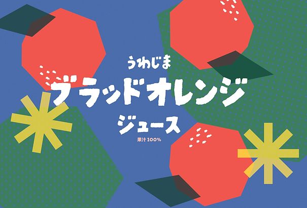
【Blood Orange】
To express the bold and distinctive character of the Blood Orange, the design features a strong geometric composition and a prominent form. A deep red inspired by the color of the fruit’s flesh was chosen to convey its rich flavor and striking individuality.
【ブラッドオレンジ】 ブラッドオレンジの力強い個性を表現するため、存在感のあるフォルムと幾何学的な構成を採用しました。色彩には果肉をイメージした深みの
あるレッドを使用し、濃厚な味わいと印象的な個性を表現しています。